
Color Psychology: What Your Shade of Green Says About Your Brand
Spring has a way of making everyone want to start fresh: new energy, new routines, and for a lot of brands, a visual reset.
And right now, green is having a moment.
From muted sage interiors to rich emerald tones on runways, green is everywhere this season. But it’s not just a trend, it’s instinctual. After months of darker palettes and heavier tones, we naturally gravitate toward colors that signal renewal, growth, and possibility.
And just like we talked about with reds and pinks, not all greens are created equal.
The shade you choose says something very specific about your brand. So if you’re leaning into that spring refresh energy, it’s worth understanding exactly what message you’re sending.
Let’s break it down.
The Greens & What They Communicate
Sage / Muted Green
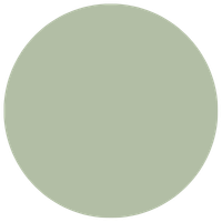
Signals: Calm, sophistication, intentionality
Sage is the quiet overachiever of the green family. It communicates balance and taste without trying too hard.
If your brand leans wellness, editorial, or simply values a sense of ease, sage does the heavy lifting in the most understated way.
Emerald / Jewel-Toned Green

Signals: Luxury, confidence, depth
Rich, saturated, and unapologetically bold, emerald communicates prestige and permanence.
It’s the shade that instantly elevates a brand, making it feel established, refined, and deeply rooted in its identity.
Olive / Earthy Green
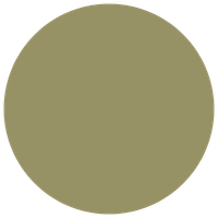
Signals: Authenticity, groundedness, warmth
An n/volve collective favorite! Olive sits at the intersection of nature and refinement. It feels lived-in, thoughtful, and intentional. It’s the brand equivalent of a perfectly curated vintage piece.
If your audience values substance over flash, olive communicates that effortlessly.
Lime / Bright Green

Signals: Energy, disruption, optimism
Not for the faint of heart and that’s exactly the point.
Lime is for brands that want to stand out in a crowded feed and aren’t afraid to be the boldest voice in the room. Used strategically, it signals freshness and forward-thinking. Used without intention, it can feel overwhelming.
The difference is always in how it’s applied.
Why We’re Drawn to Green in Spring
There’s a reason green shows up this time of year and it goes beyond aesthetics.
Psychologically, green is associated with growth, renewal, and balance. It sits at the center of the color spectrum, which makes it feel inherently grounding and easy on the eyes. It’s a color that doesn’t demand attention, but instead creates a sense of calm and stability.
In spring, when everything around us is quite literally coming back to life, that connection becomes even stronger.
And that’s what makes it so powerful for brands this season. It aligns with what your audience is already craving: clarity, simplicity, and a fresh start.
Why This Matters for Your Brand
Color shapes perception before a single word is read.
If your brand isn’t landing the way you want it to, your palette might be the reason.
So ask yourself:
What do you want people to feel when they see your brand this season?
Start there and let the color follow.
If you’re ready to build a brand that actually reflects where you’re headed, I’d love to hear what you’re working on.
Let's start with a strategic conversation about your vision.
Schedule your complimentary 30-minute discovery call and let's create something extraordinary together.