
5 Things I Stopped Doing When Designing Websites for My Clients
Your website looks expensive but isn't converting.
Here's why: it was designed backwards.
For years, I followed the "rules" of web design: start with visuals, fill every section, add as many pages as possible.
But these rules distracted from the real goal: a website that actually connects and converts.
Below are five things I stopped doing and how rethinking them improved results for my clients:

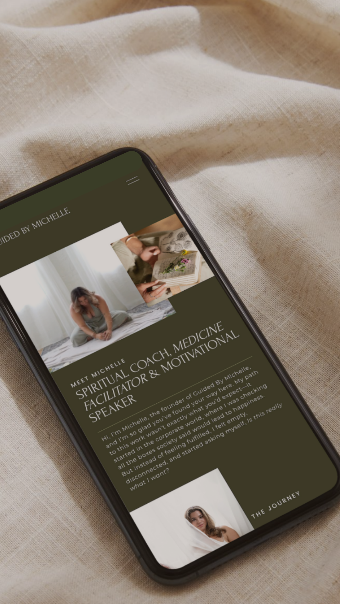
1. Designing the website before the copy was written.
Strategy and messaging come first. Always.
A gorgeous website with vague, placeholder copy is just expensive decoration. I won't even start designing until we know exactly what we're saying and who we're saying it to.
Design without messaging is like building a house without a blueprint: it might look impressive at first, but it won't function as it should. By prioritizing strategy first, we clarify the story, understand the audience, and make every design decision intentionally. This shift ensures that every layout, image, and interaction supports the client's message, not just their aesthetic.
2. Using generic stock photos and "lifestyle" imagery just to fill space.
Every image should reinforce your positioning or help your client picture the transformation.
If a photo doesn't support the story we're telling, it's visual clutter. I'd rather use bold typography or white space than throw in a random image of someone smiling at a laptop.
Images are powerful, but only when intentional. Random or generic visuals distract, dilute messaging, and make a brand feel less authentic.

3. Building websites with a million pages.
More pages doesn't equal more professional.
I've seen 3-page websites convert better than 12-page ones because every single word had a job. Now I ask: does this page actually serve your client's journey, or does it just make you feel more "legit"?
Every additional page adds cognitive load. Instead of overwhelming visitors with information, we focus on the pages that matter. This keeps the website lean, purposeful, and easy to navigate, ultimately improving engagement and conversions.
4. Prioritizing the mood board over what works for the actual audience.
Your dream client doesn't care if your website would win a design award. They care if they feel understood when they land on it.
I design for clarity and connection first, aesthetic second.
Your audience isn't evaluating your site on style points. They're evaluating whether it speaks to them. By focusing on clarity, intuitive messaging, and audience-centered design, the website builds trust immediately, making visitors feel understood and confident to take the next step.
5. Treating the website as a one-time project instead of eliminating the chronic rebrand cycle.
A website isn't "done" at launch. It's just ready to start working.
But here's the thing: when you build on strategic foundation instead of aesthetic trends, your website doesn't need constant overhauls. It evolves with your business instead of fighting against it.
I set my clients up knowing they'll refine messaging and offers as they grow, but the foundation stays timeless. The goal is a living, strategic asset, not a digital monument you'll want to tear down in six months.
Ready to Build a Website
That's Designed to Perform?
At n/volve collective, we specialize in creating timeless, magnetic brands and conversion-focused websites that transform ambitious businesses into brands sophisticated audiences seek out and remember. From comprehensive brand strategy to custom website design, we'll help you craft every touchpoint to reflect your premium positioning and attract clients who value excellence.
Before we touch design, we start with strategy. Your expertise is premium and your brand should reflect that.
Let's start with a strategic conversation about your vision.
Book your discovery call and we'll clarify what your website actually needs to say.